

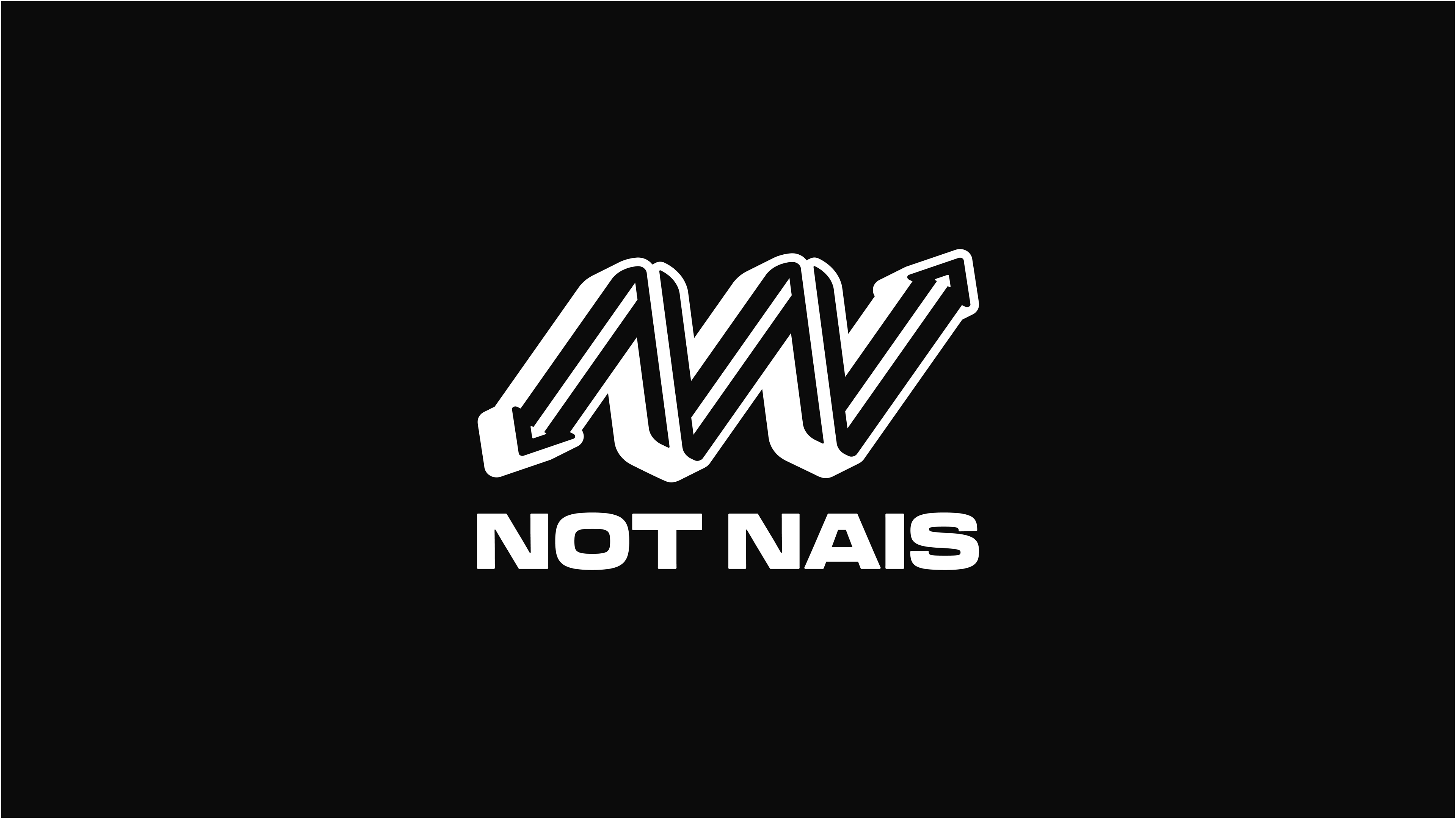
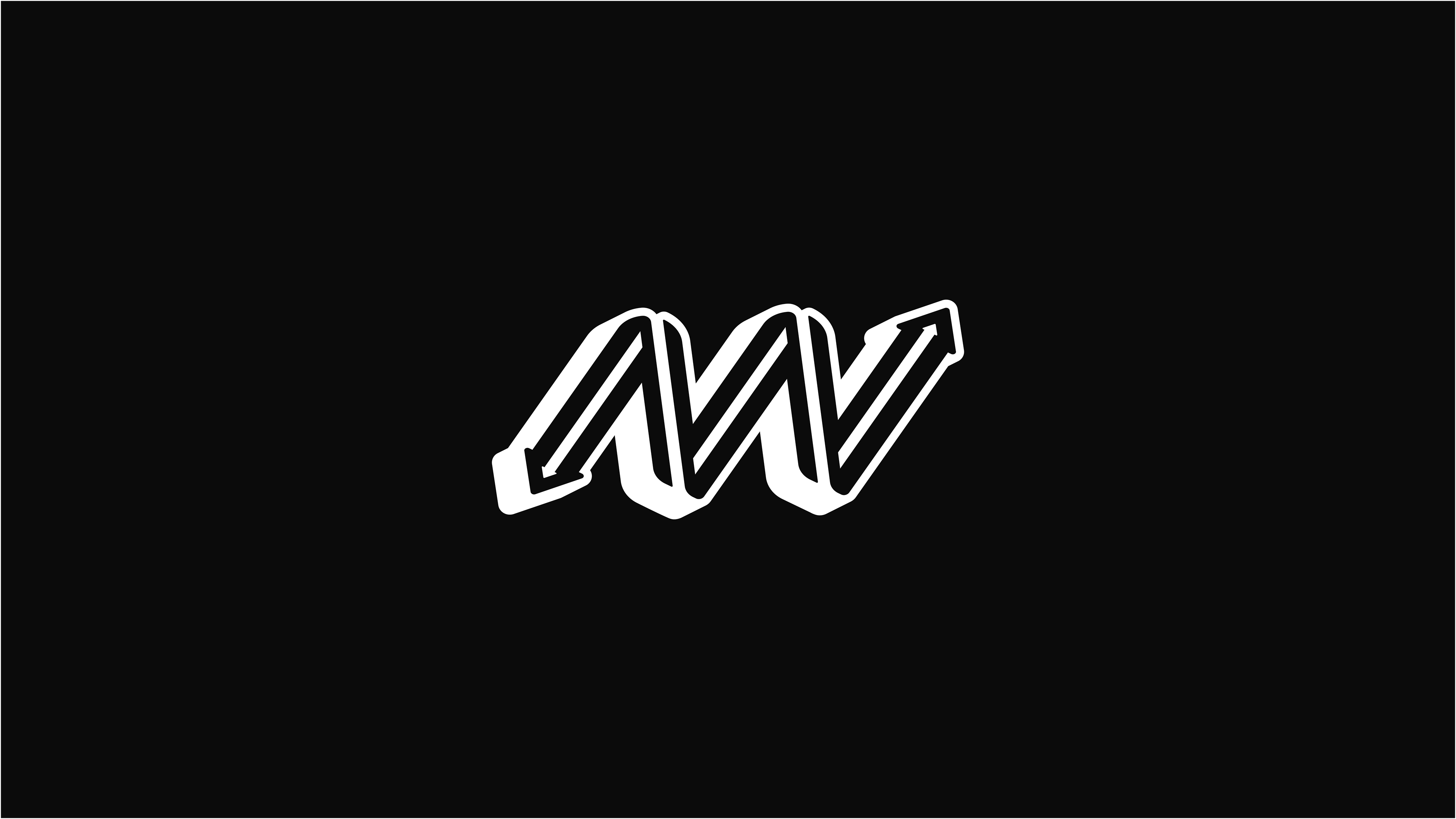
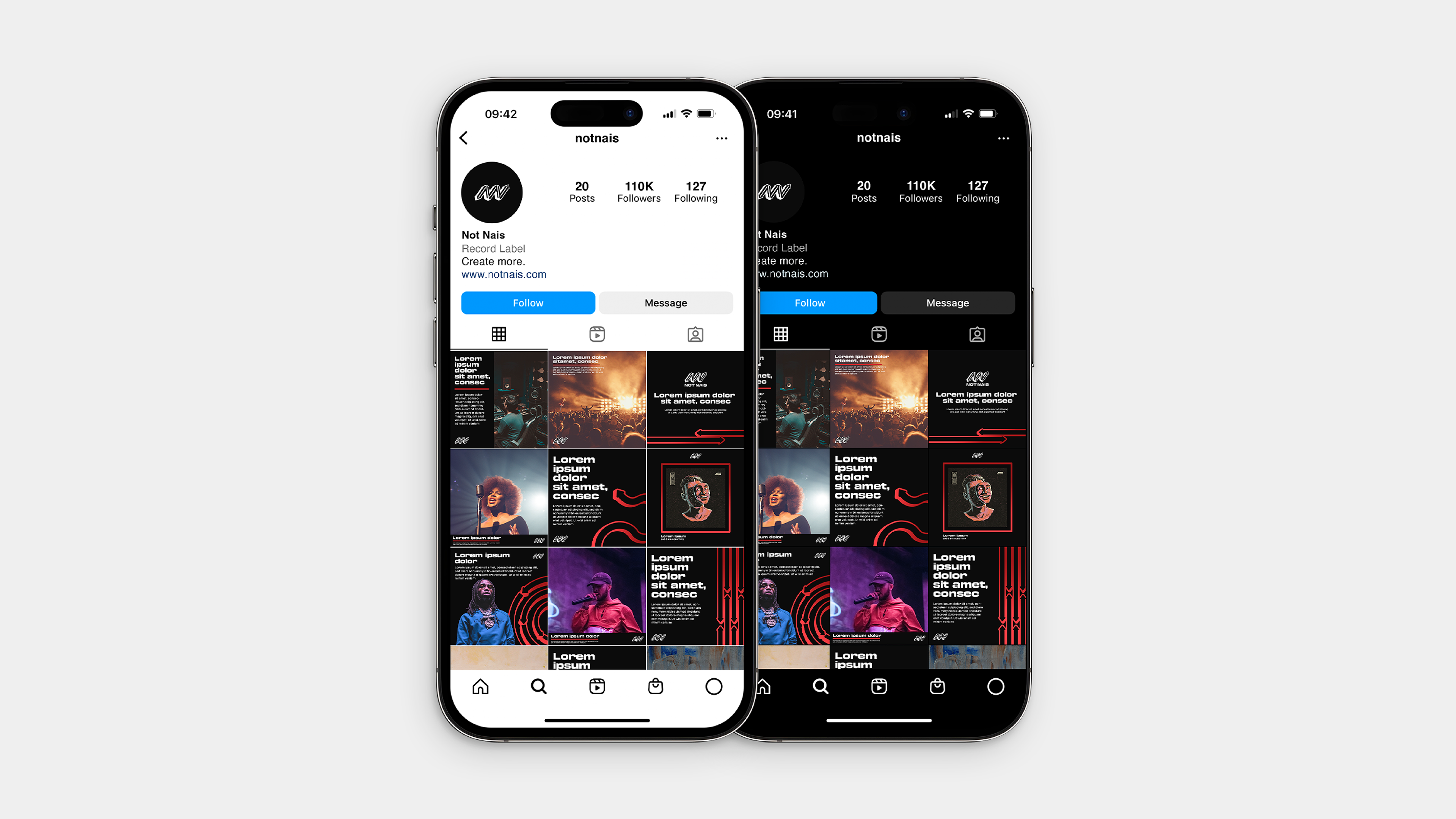
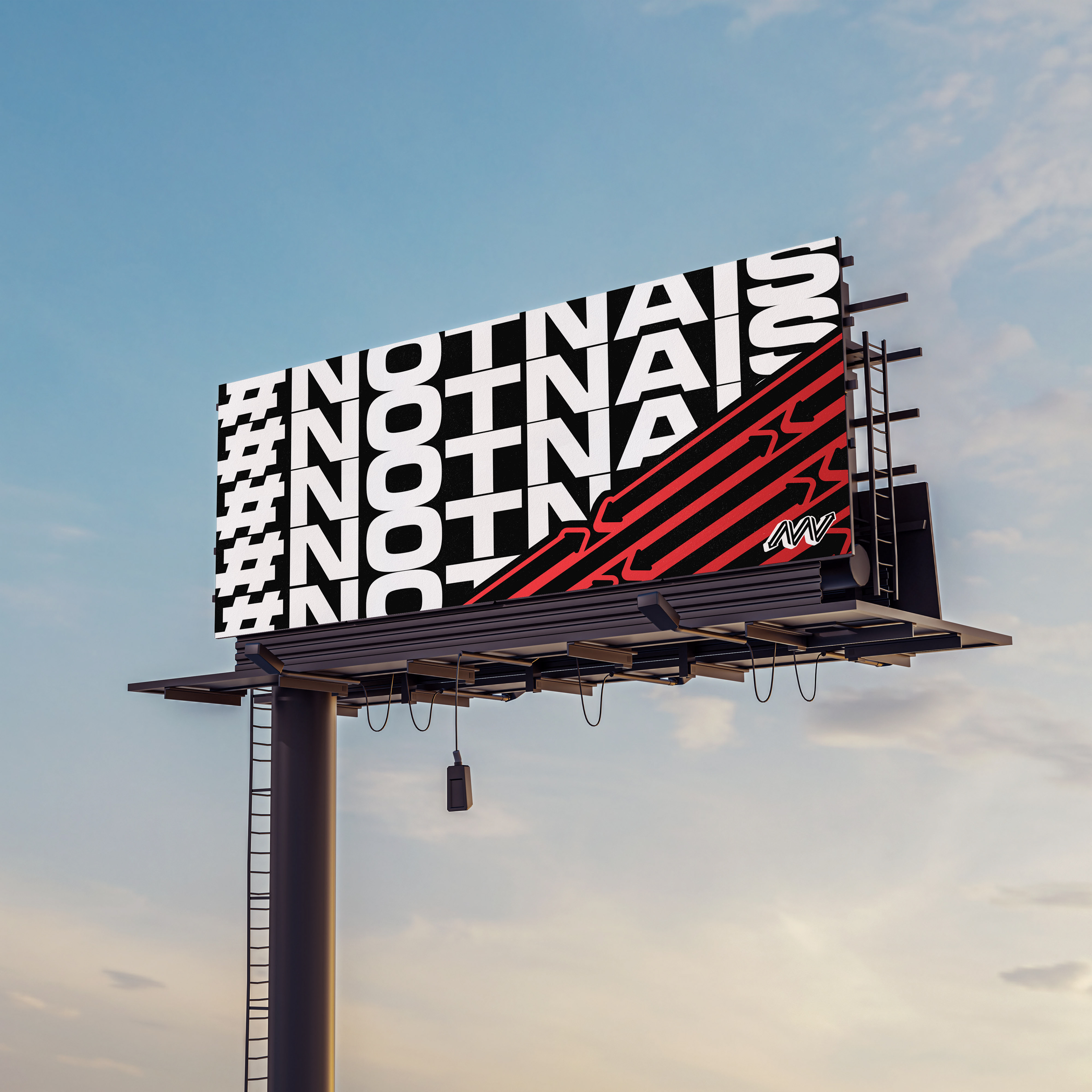
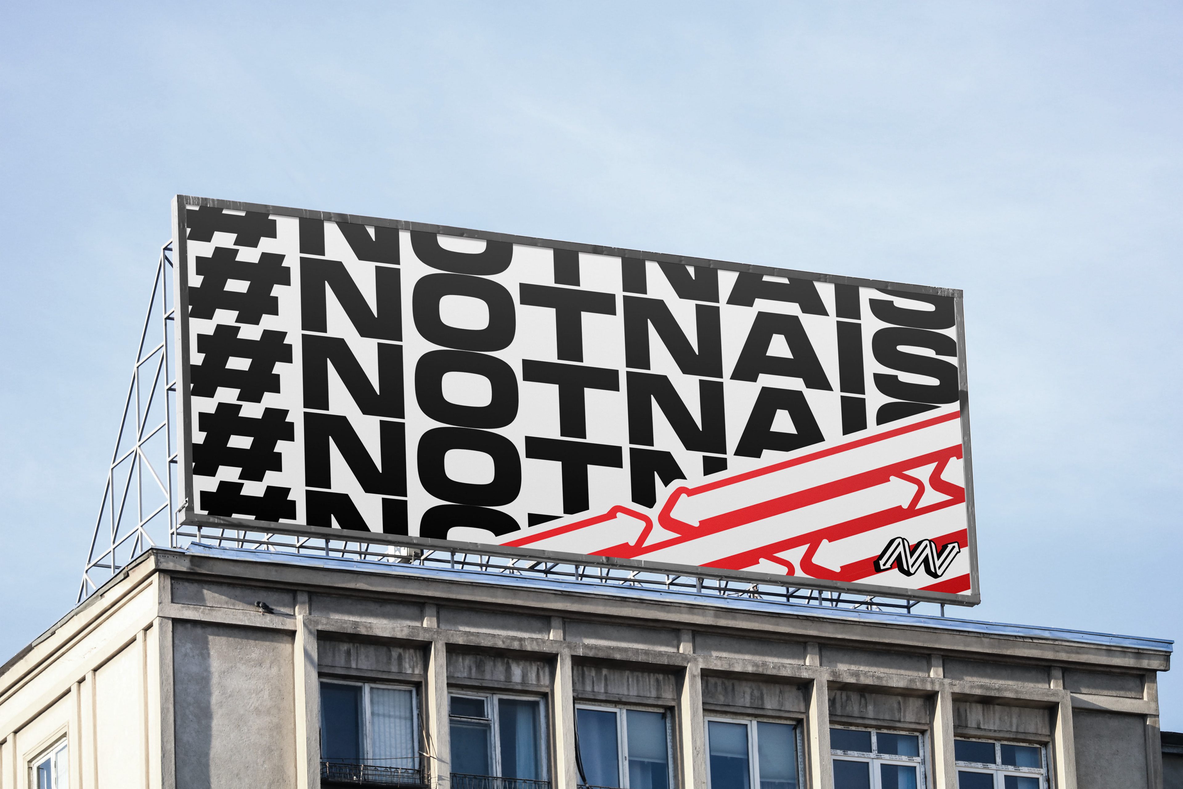
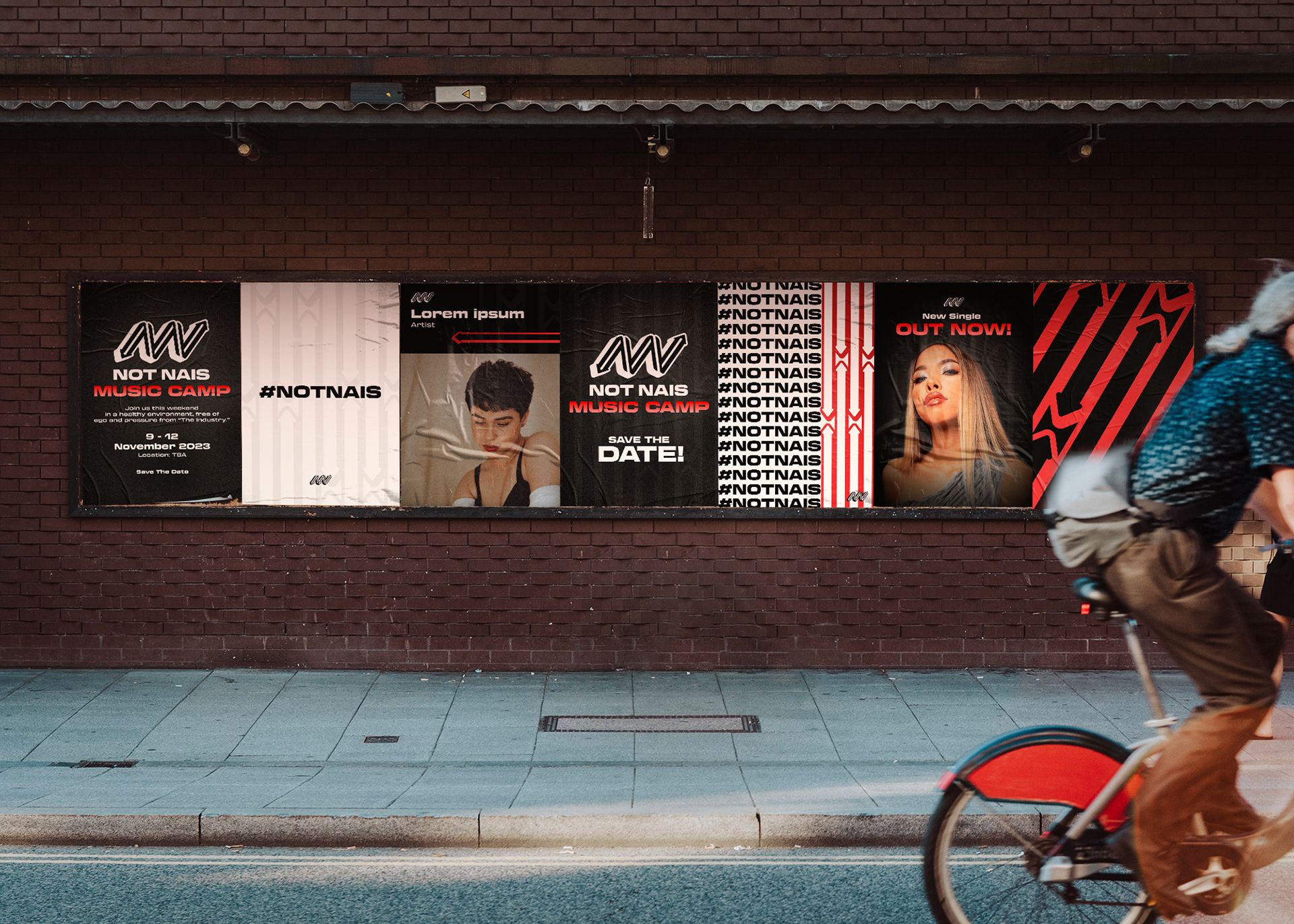
The icon consists of two N’s forming an arrow together representing the art of irony + bold, direct, and raw approach that challenges conventional thinking. It has a strong, thick, and impactful typeface to convey a sense of confidence, strength, and authority.

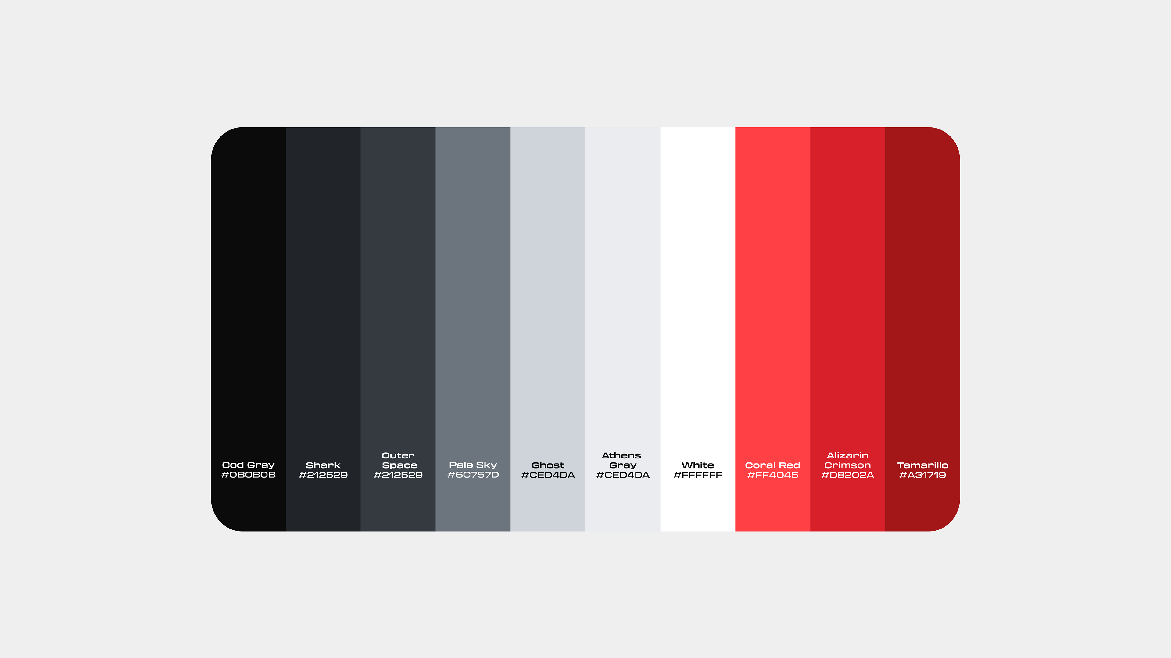
The color palette is a bold and minimalist combination featuring striking variants of red, white, and gray tones. The red variant adds energy and passion, while the white brings clarity and simplicity, offering a clean contrast. Gray tones balance the palette with a neutral, modern touch, providing a sleek, professional finish. Together, these colors evoke a sense of confidence and understated sophistication, making them ideal for contemporary designs with a strong visual impact.
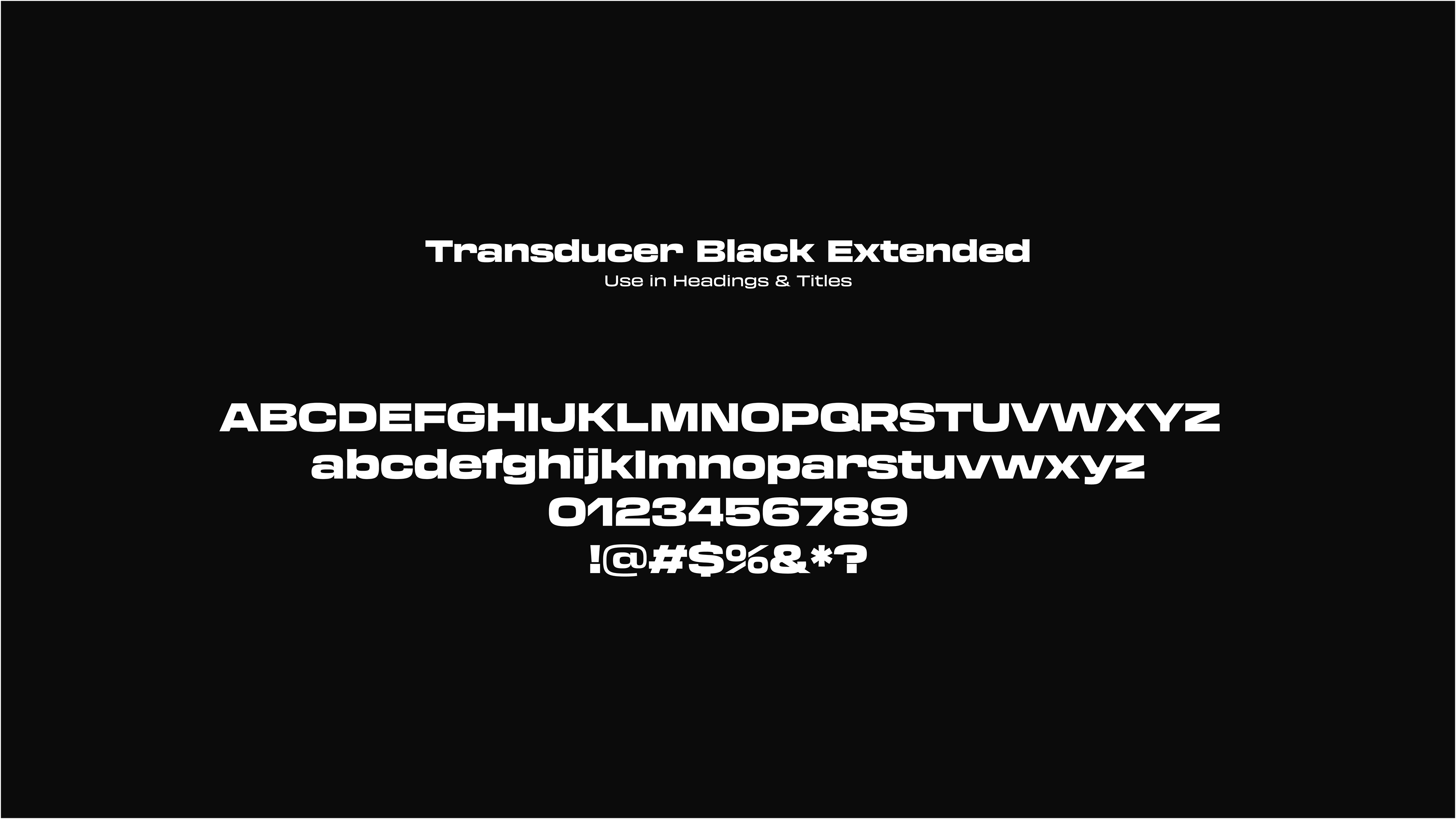
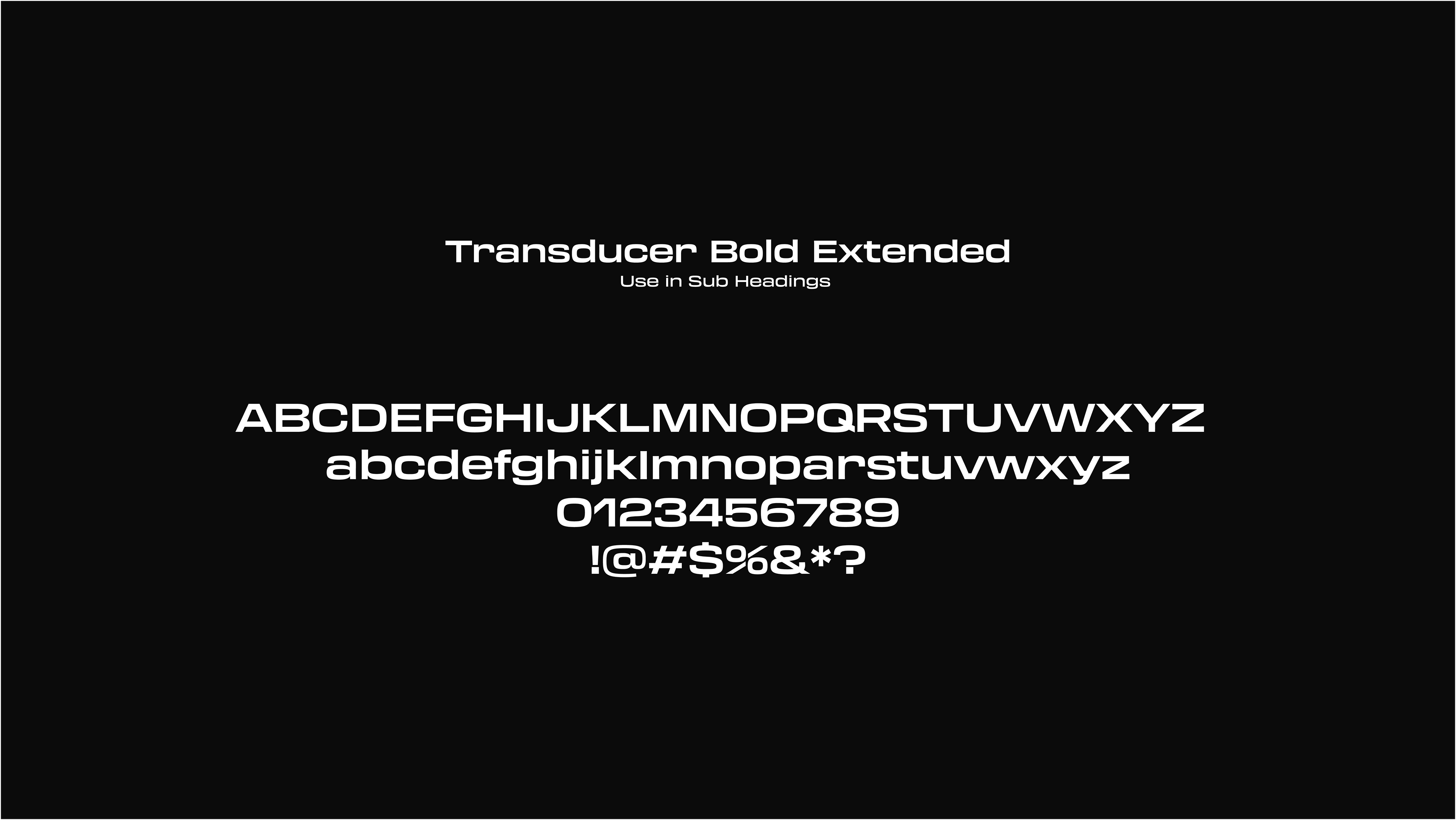
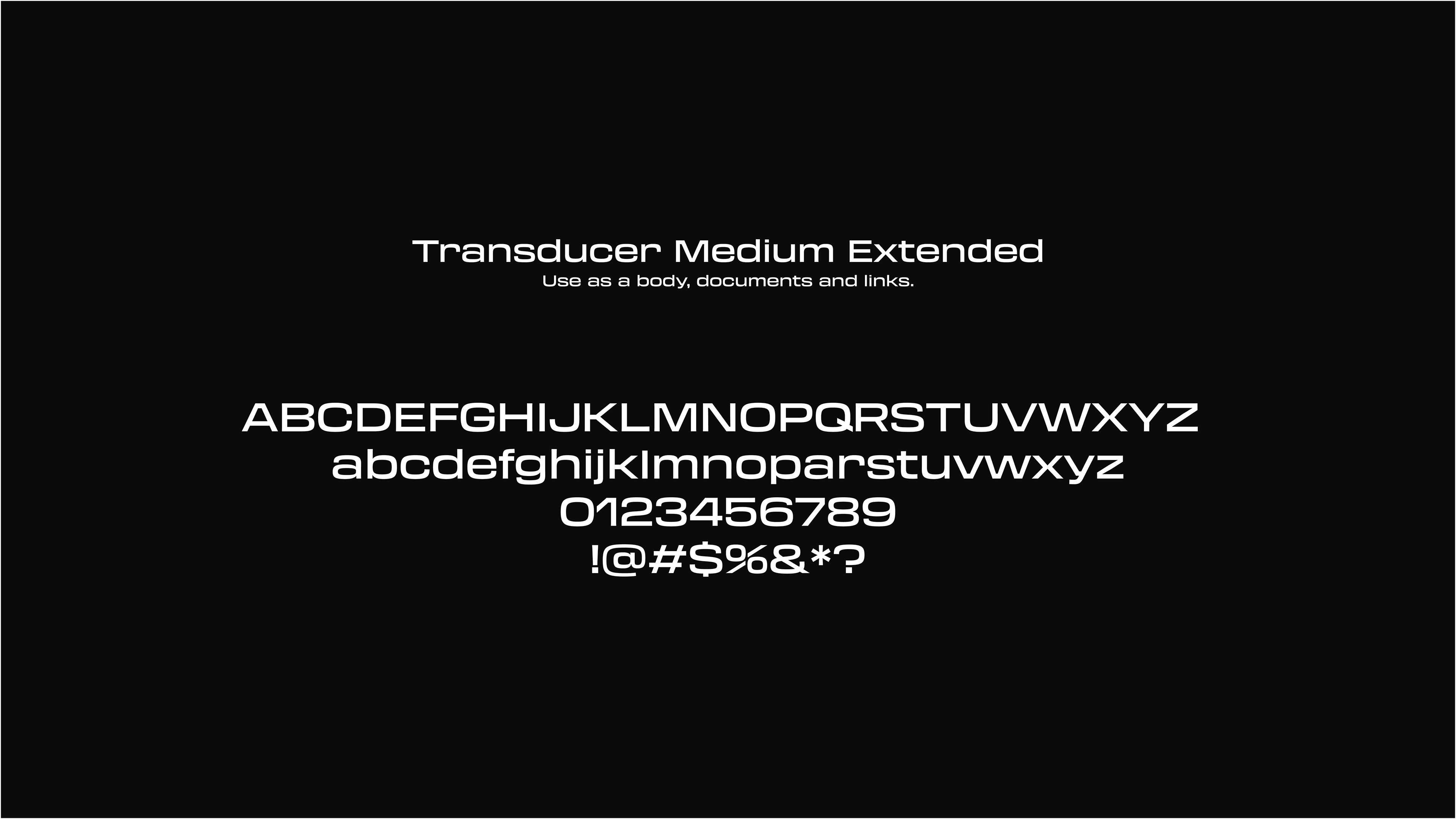
The Transducer Extended font family is a modern, sleek typeface known for its bold, elongated letterforms. It combines geometric precision with a futuristic aesthetic, making it ideal for high-impact designs such as tech branding, posters, and digital interfaces. Its extended proportions enhance readability while giving text a distinctive, commanding presence.
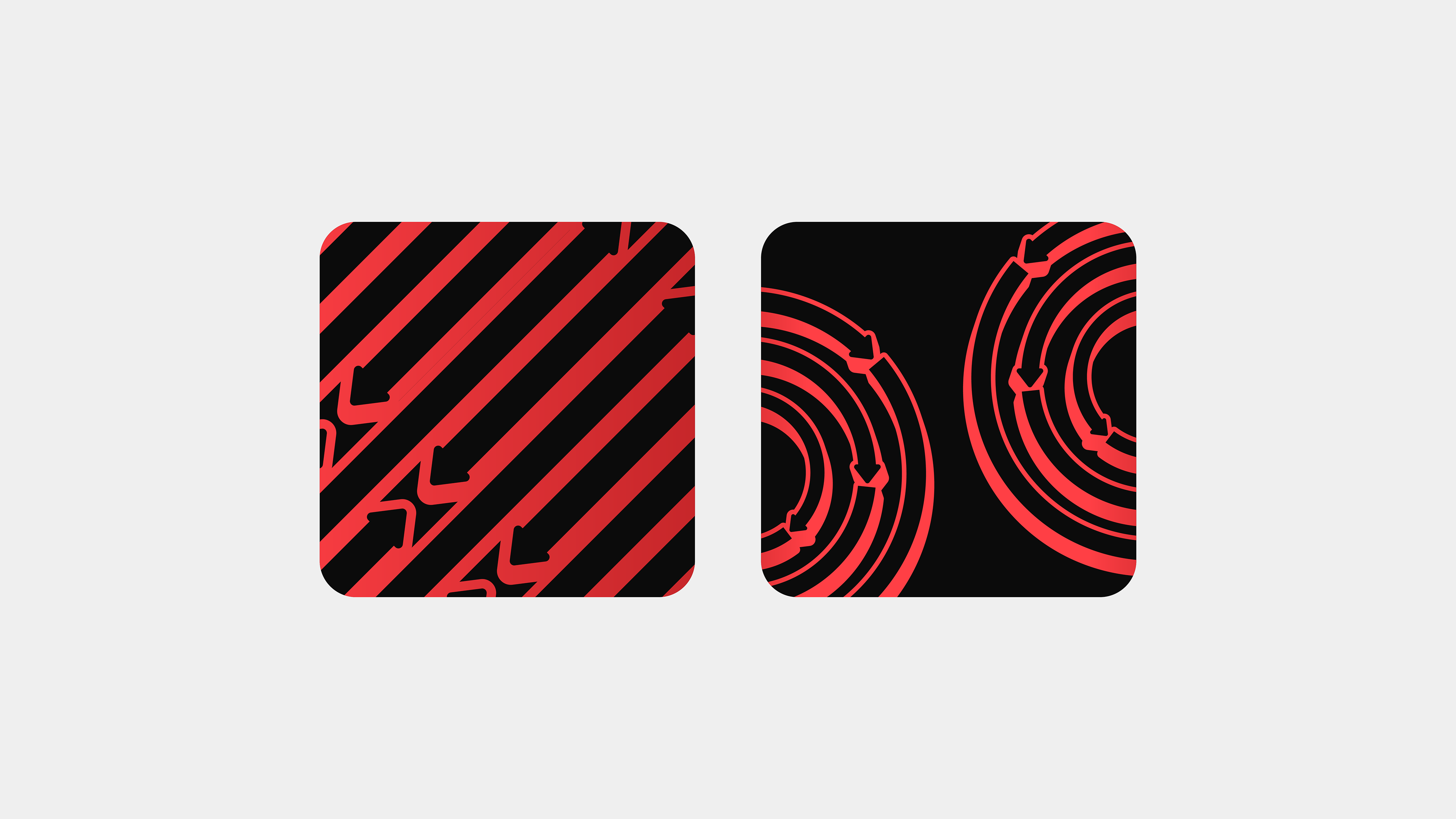
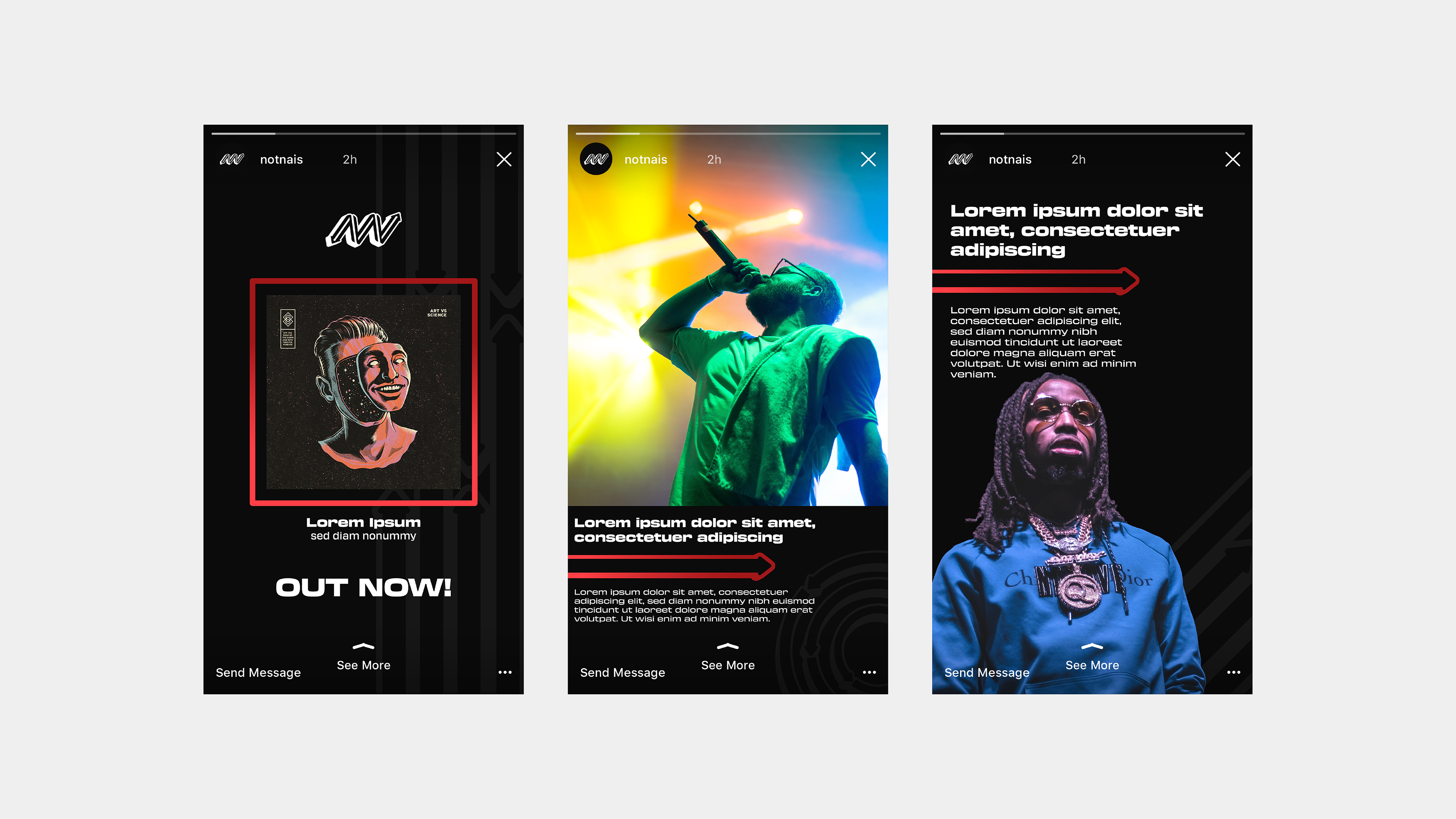
The Not Nais branding patterns feature bold, extruded red arrows that meticulously follow the steps of the logo’s icon, creating a sense of movement and progression. These arrows, designed to mirror the sequential flow of the logo, symbolize growth and forward motion.
•Powered by UNLMTD•