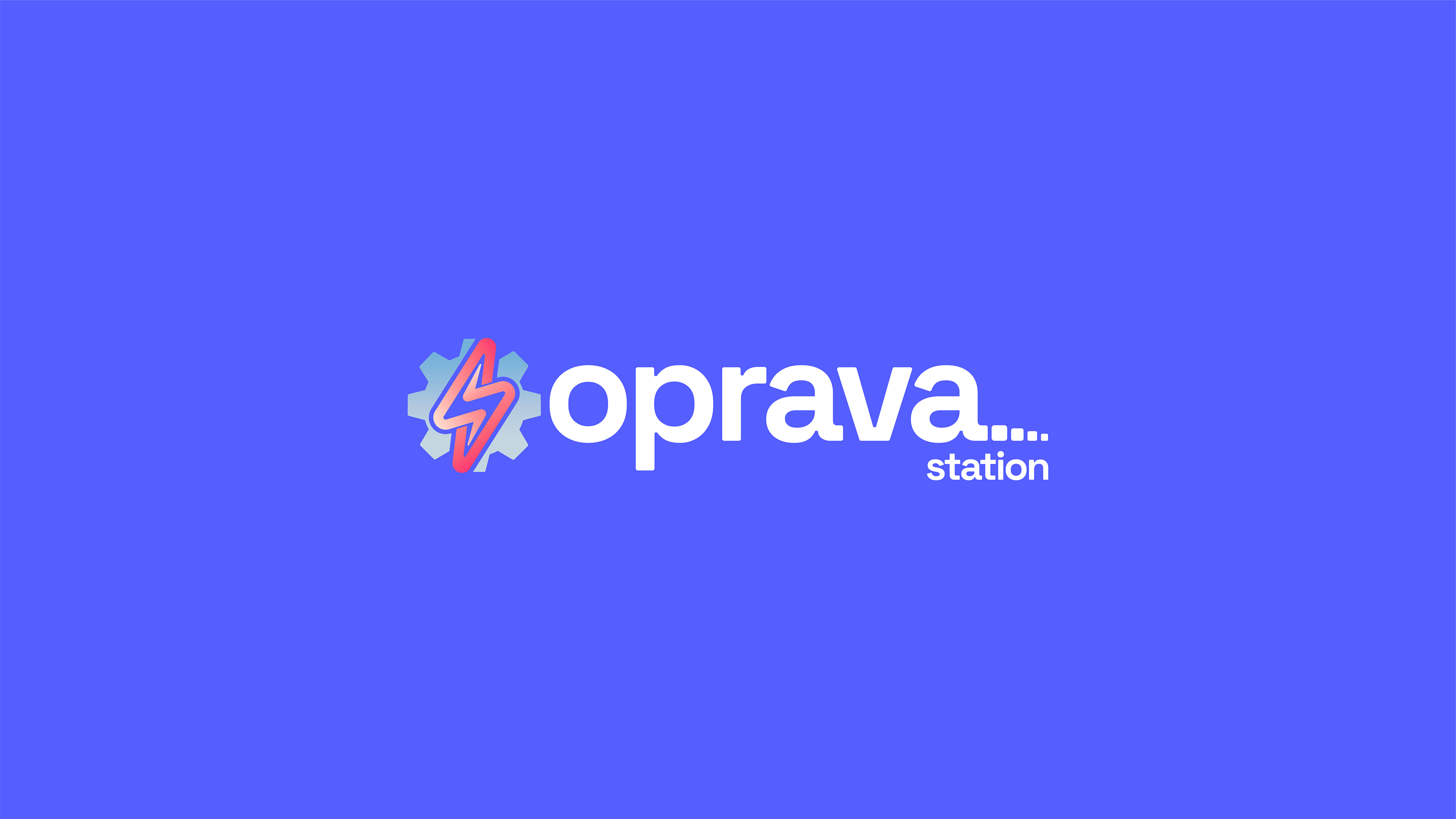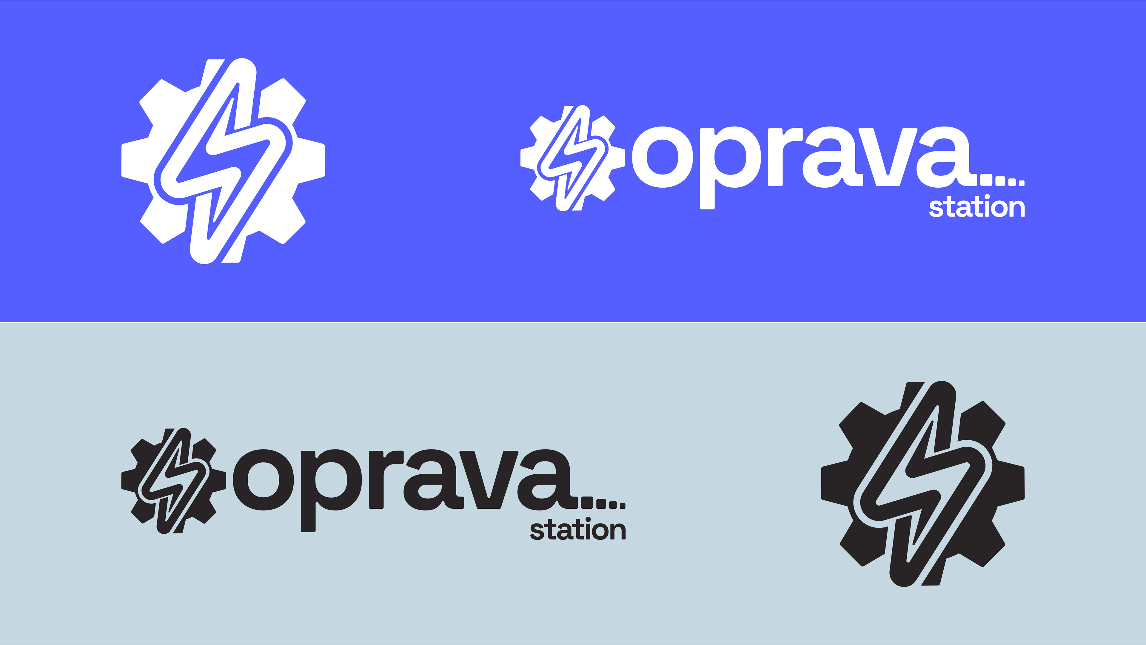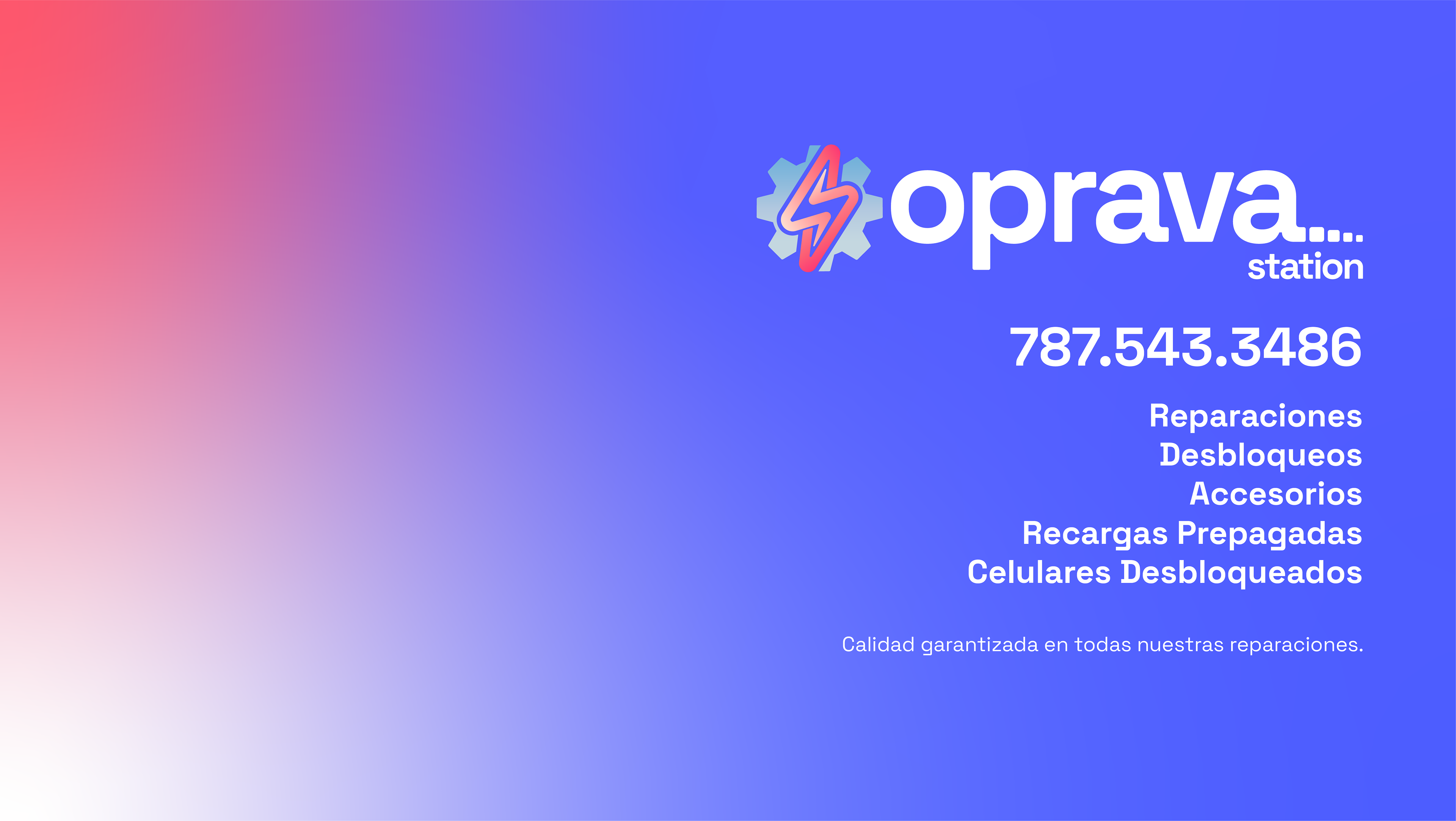

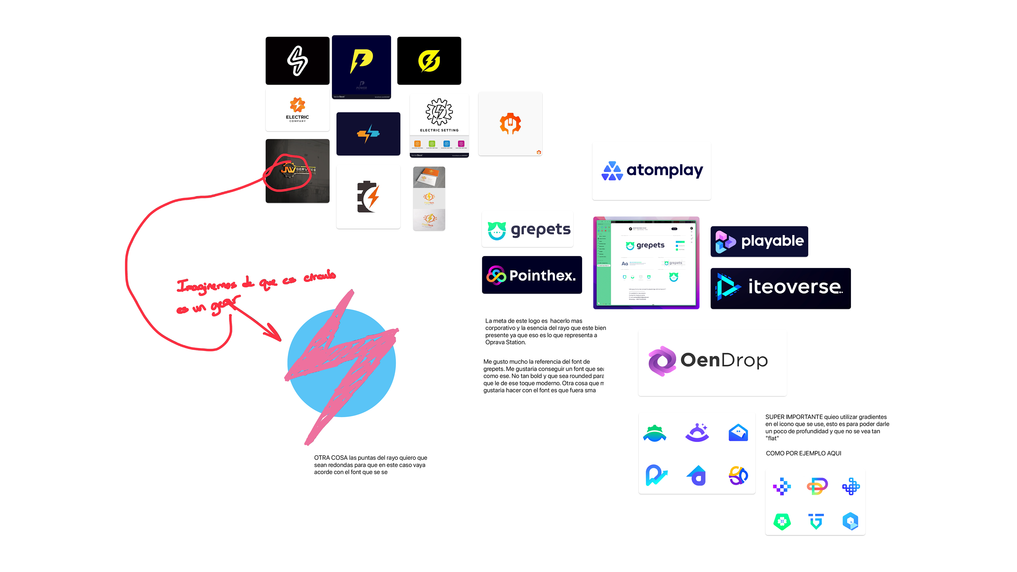
The goal in this design was to make a logo that represented the repair elements. But in this case the lightning bolt was used to represent energy as well. Since without energy, electronic equipment does not work. We took it very literally with the icon, since it has a nut and a lightning bolt on top. I wanted to make the font similar to the Android one since I really liked how it looked and at the end of Oprava it has the signal bars of mobile phones.