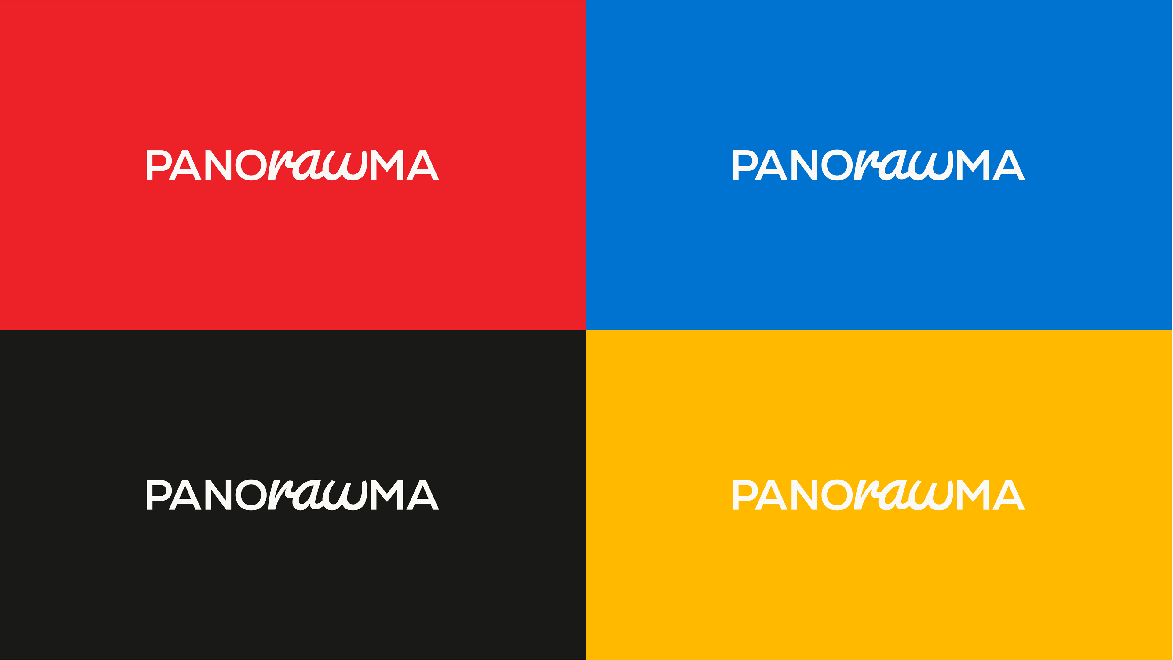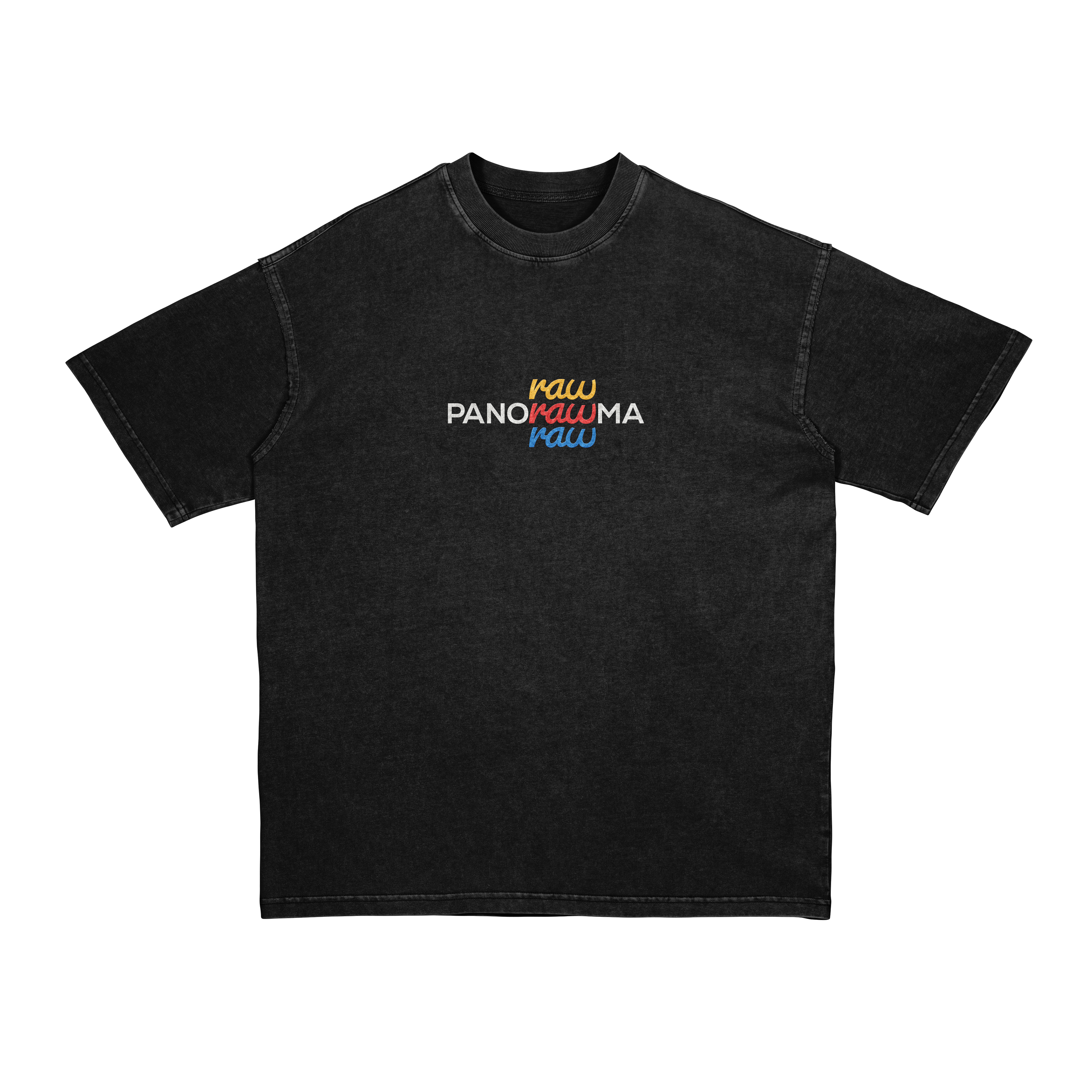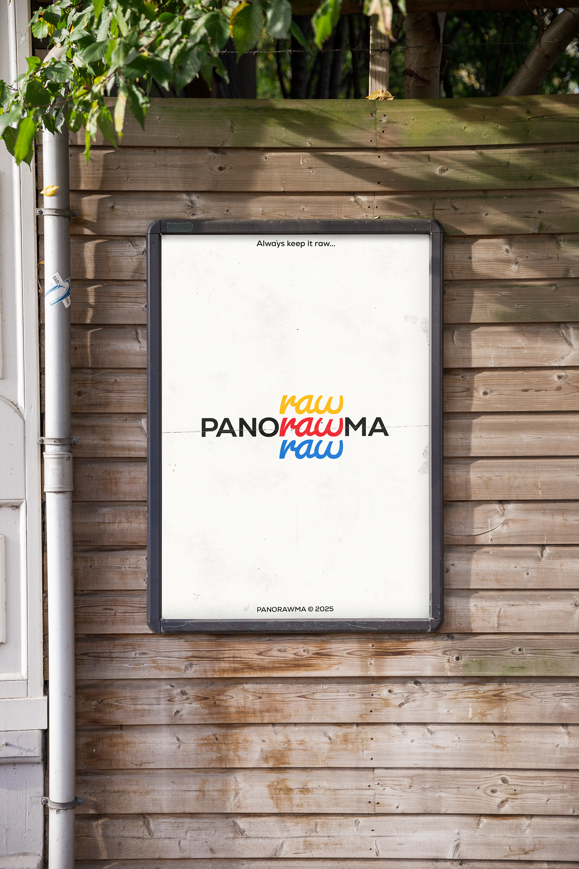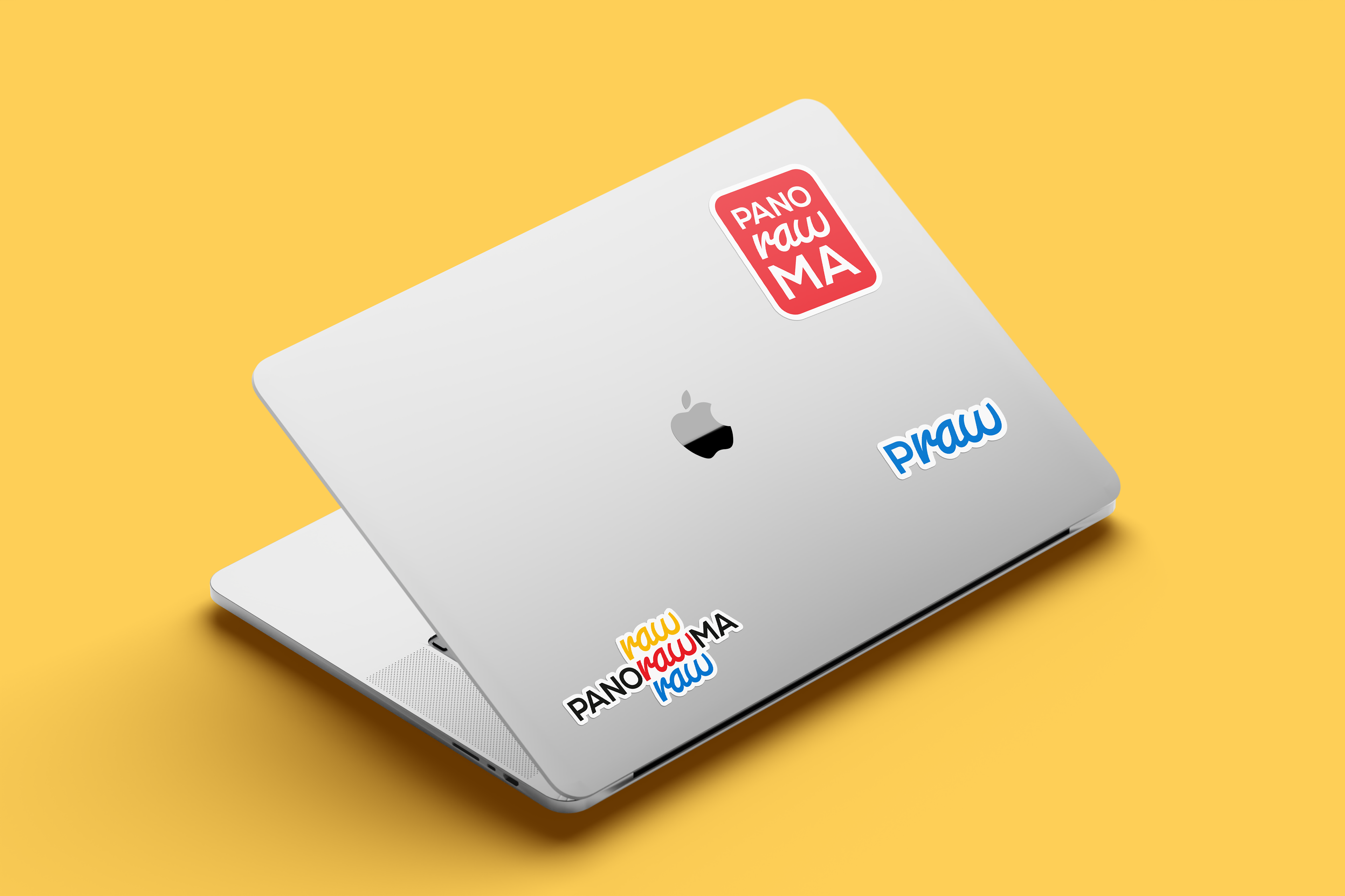

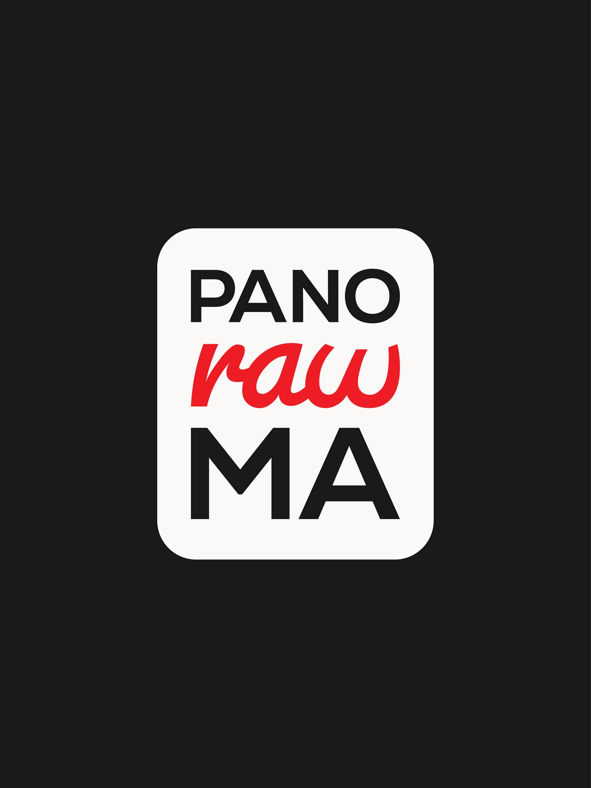
The word "raw" is rendered in a script font to visually represent its literal meaning: an unprocessed, human, and authentic element. While "PANO" and "MA" are set in a structured, processed typeface, the script font highlights the "raw" talent and organic creativity that define the brand's core.
This contrast emphasizes Panorawma’s mission to elevate storytelling by blending technical precision with untouched, limitless artistic expression.
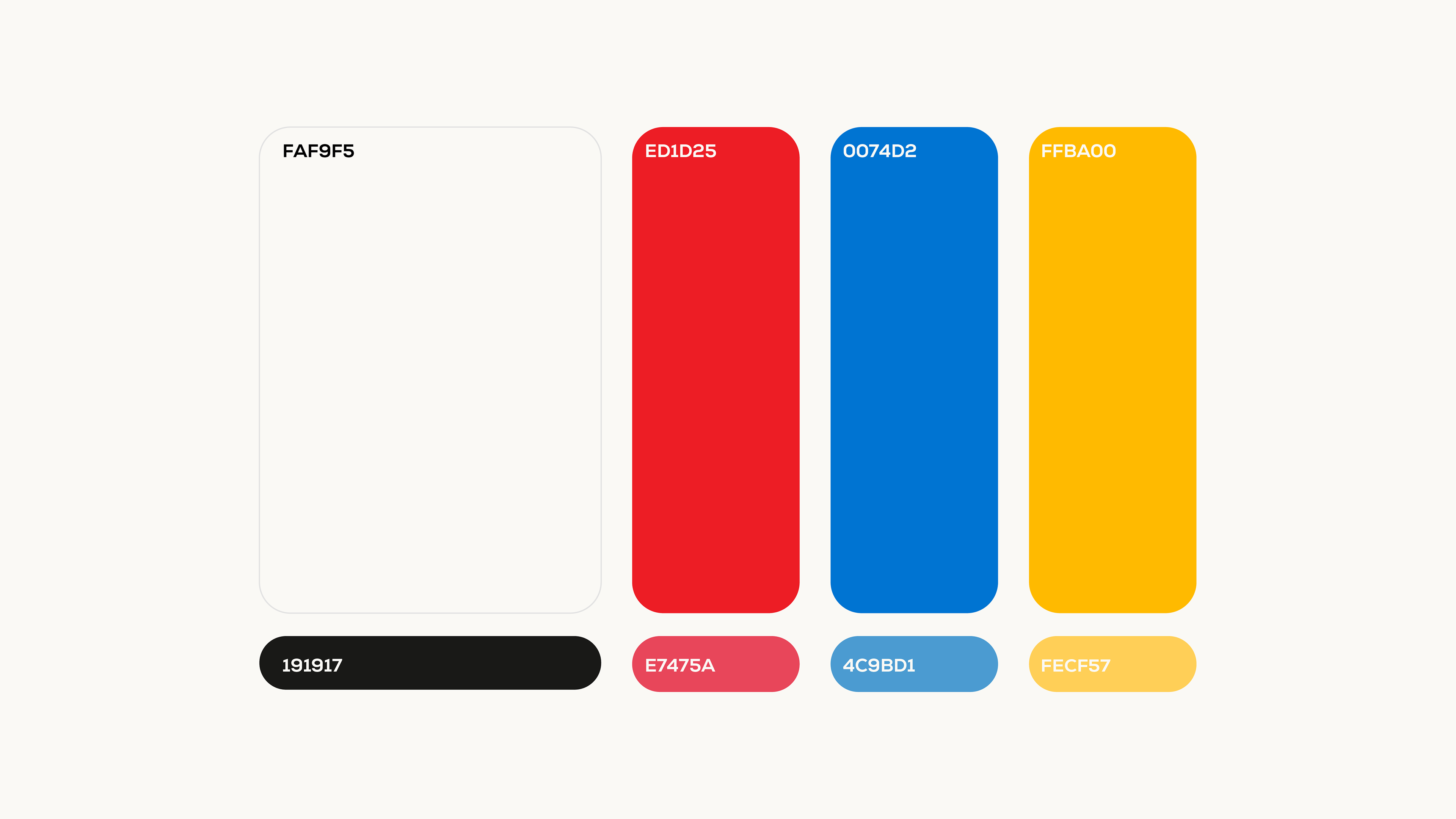
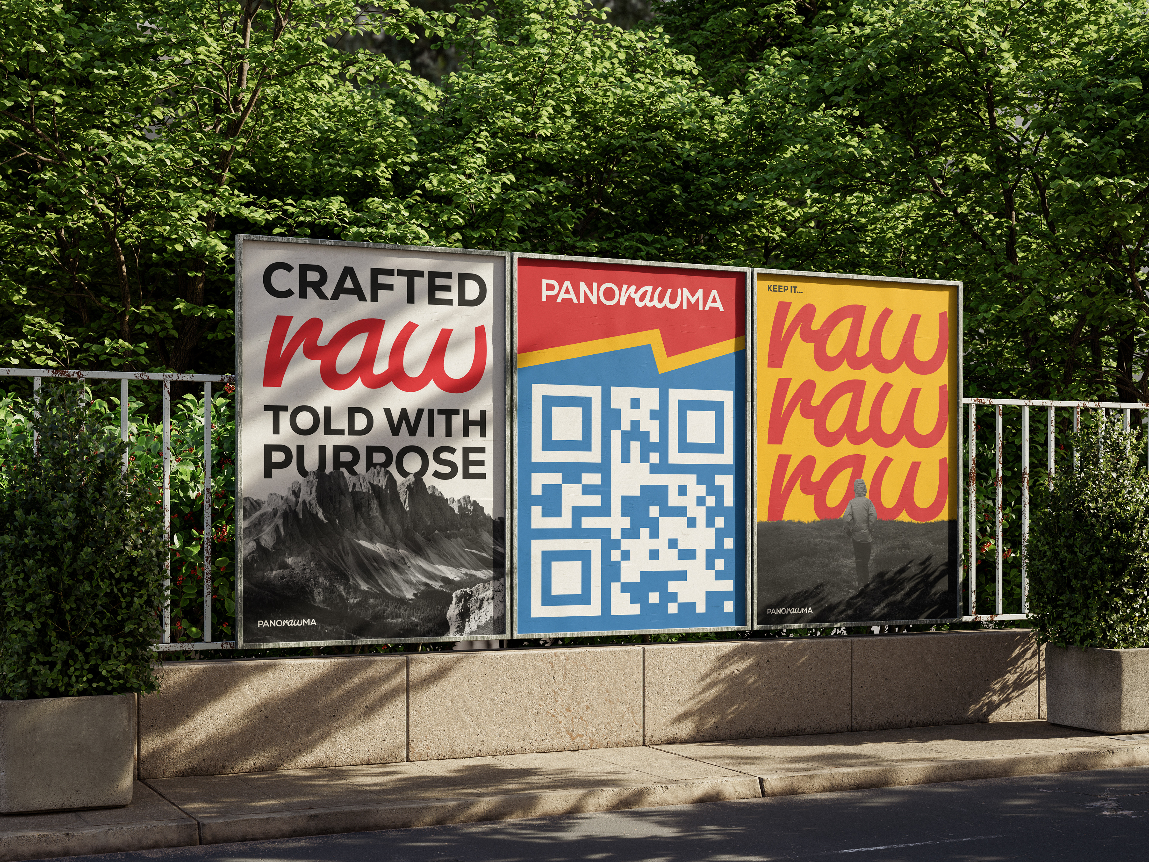
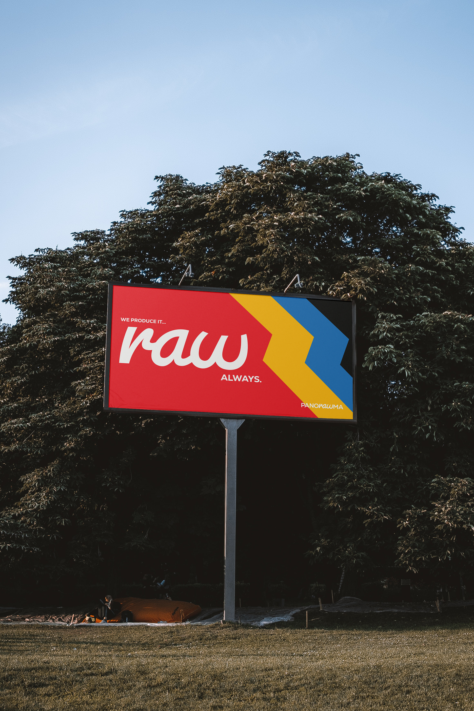
It's color palette draws direct inspiration from the retro packaging of classic film stocks, such as Kodak and CineStill. By utilizing these iconic primary tones—vibrant reds, deep blues, and warm yellows—we evoke the nostalgic soul of analog film while maintaining the bold, modern edge of a leading creative agency.